


When it comes to professional printing, choosing the right colors is crucial for maintaining visual consistency, creating attractive packaging, and projecting the right brand image. When discussing color, you may hear the terms CMYK and Pantone, whether you’re creating packaging, posters, or business cards. Although both are widely used in the print industry, their functions and methods of operation differ. The differences between CMYK and Pantone colors, their functions, when to use them, and their benefits and drawbacks—particularly with regard to printing—are all covered in this article.
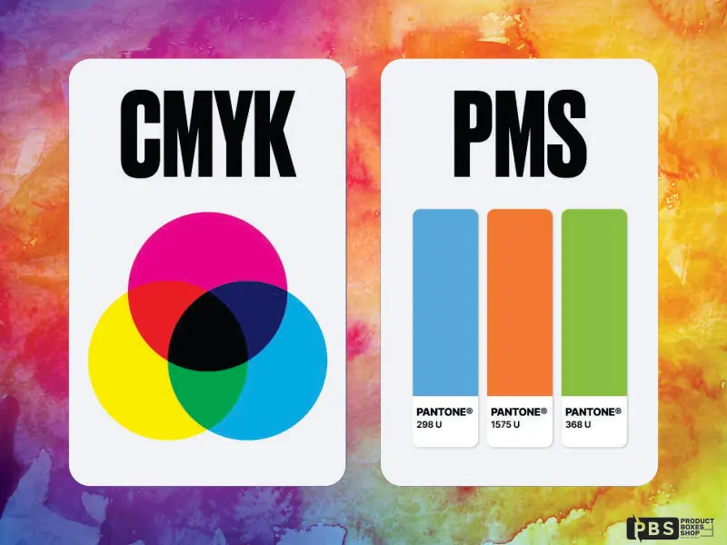
What Is CMYK?
Selecting the appropriate colors for professional printing is essential for preserving visual coherence, producing eye-catching packaging, and presenting the ideal brand image. Whether you’re making business cards, posters, or packaging, you might hear the terms CMYK and Pantone when talking about color. Despite their widespread usage in the print industry, they serve different purposes and operate in different ways. Now we will discuss the differences between CMYK and Pantone colors, their uses, when to use them, and their advantages and disadvantages, especially when it comes to printing.
What Is Pantone?
Pantone, sometimes referred to as the Pantone Matching System (PMS), is a system that helps guarantee that colors appear consistent across various printing jobs, designers, and manufacturers. Pantone employs specially designed inks to produce precise, repeatable colors, as opposed to CMYK, which blends colors while printing. Pantone 186 C, for instance, is a particular red color with predetermined pigment concentrations. As long as the printer correctly employs the Pantone system, it ought to appear the same whether it is printed in the United States, Europe, or Asia. CMYK alone cannot produce Pantone’s thousands of color codes, which include metallics, delicate pastels and vivid neons.
CMYK vs. Pantone Colors: What’s the Difference?
When comparing CMYK and Pantone colors, the main difference is how colors are made and applied in print. CMYK creates colors by mixing four inks during the printing process.
Pantone, on the other hand, uses a single, specially made ink that’s already mixed before printing. This difference affects the outcome in a few ways:
Color Consistency:
Pantone is more accurate in terms of color consistency. Colors in CMYK can vary slightly depending on the type of paper, ink quantity, and printer configuration. Large brands use Pantone colors for their packaging and logos because they are consistent.
Color Selection:
Pantone provides a greater selection of vivid hues, such as deep blues, metallic tones, and bright oranges, that are challenging to create using CMYK. Some bright or metallic colors are difficult for CMYK to match because of its smaller color gamut.
Cost:
CMYK printing is typically less expensive, particularly for full-color designs. Pantone can be more costly and requires more setup, particularly if you use several spot colors.
Flexibility:
Photos or artwork with a lot of colors that blend collectively work better in CMYK. For flat color areas that must match a particular brand, Pantone works best.
Which Should You Use: Pantone Solid or CMYK?
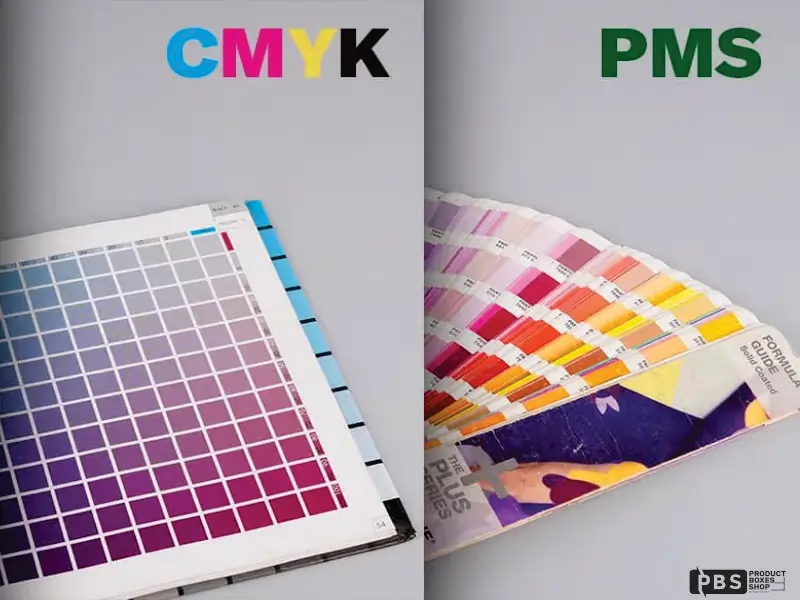
When preparing files for printing, numerous designers are unsure whether to use CMYK or Pantone solid. Pantone Solid describes the common spot color inks, such as Pantone Solid Coated or Uncoated swatches, that are listed in the color guides. When you want exact, reliable color results, you use these. Pantone colors in CMYK, on the other hand, are merely estimates.
Although they aren’t exact matches, they can approximate Pantone colors in four-color printing.
So, should you choose CMYK or Pantone solid? If you require precise color matching, such as for logos, brand components, or packaging that must have the same appearance wherever it is printed, use Pantone Solid.
If your design includes full-color artwork, gradients, or images and you want to use typical digital presses or save money, use CMYK. Spot colors for logos and CMYK for backgrounds or images are even used in some print jobs. This can provide the best of both choices and is known as spot color + process printing.
Final Thoughts
Designers, marketers, and anyone else working in packaging or branding must be aware of the differences between CMYK and Pantone Printing. Pantone is the greatest option for accurate color and uniformity, while CMYK is versatile and reasonably priced for full-color printing.
There is no right or wrong way to use Pantone solid or CMYK; what matters is what suits your project the best.Use CMYK if you want to save money or print detailed images. Select Pantone if you want your color to appear consistently across all materials.
Share on: